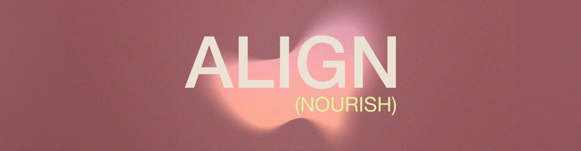
Align (Nourish)
The sister conceptual wellness brand to Align the pilates studio. It needed to work alongside and communicate the brand’s story. My goal when creating Align (Nourish) was to make sure that you could feel its message of balance and this inner light radiating out from the moment you had your eyes on it. Whilst also being aesthetically pleasing.
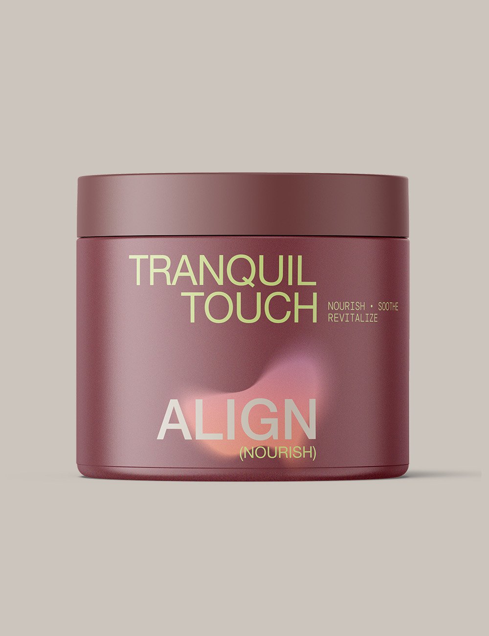
Solution
✨ The clean modern minimalist type is carefully aligned to reflect balance and clarity
✨ The soft gradients were selected to represent the inner light and nourishment felt in the body from using the products
✨ Earthy colour tones to support grounding, health and nourishment
✨ To distinguish the Essential Oils variants, a colour system was introduced
NAMING
BRAND IDENTITY
PACKAGING DESIGN


Here’s how we’ve built New Era’s for other visionaries
-
![]()
Align (Nourish)
-
![]()
Wave
-
![]()
Sunday Glow
-
![]()
Method Lab
-
![]()
Olew
-
![]()
Wave
-
![]()
Align (Form)